Promotional Product Colours: How to Choose So Your Logo Stands Out
A guide to choosing promotional product colours so your logo stays legible: contrast, Pantone, printing technologies and specific examples from our catalogue.
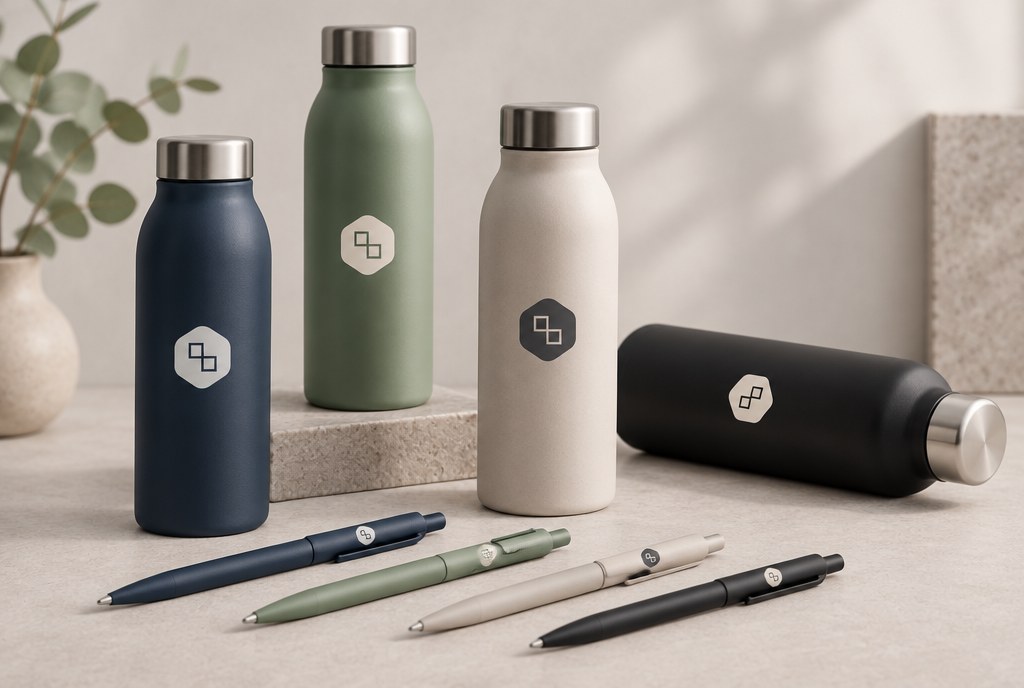
When choosing promotional product colours, the main criterion isn't your brand colour, but the contrast between the product surface and the logo: a dark logo on a light product and a light logo on a dark product stay legible even from 3–5 metres away. In practice, a safe choice is a uniform, matte surface with a logo whose smallest letter is no less than 2 mm, while the overall print width should be at least 40–50 mm on a T-shirt and 25–30 mm on a pen or notebook. If your brand colour is almost identical to the product colour, it's better to change the product colour rather than the logo.
Contrast Matters More Than the Exact Shade
The human eye first perceives differences in brightness, not colour nuance. That's why a blue logo on a navy polo shirt may look "clean" up close, but from three metres away it simply disappears. Before placing an order, we recommend a simple check: convert both the logo and the product colour to greyscale. If both greys look similar, there's no contrast.
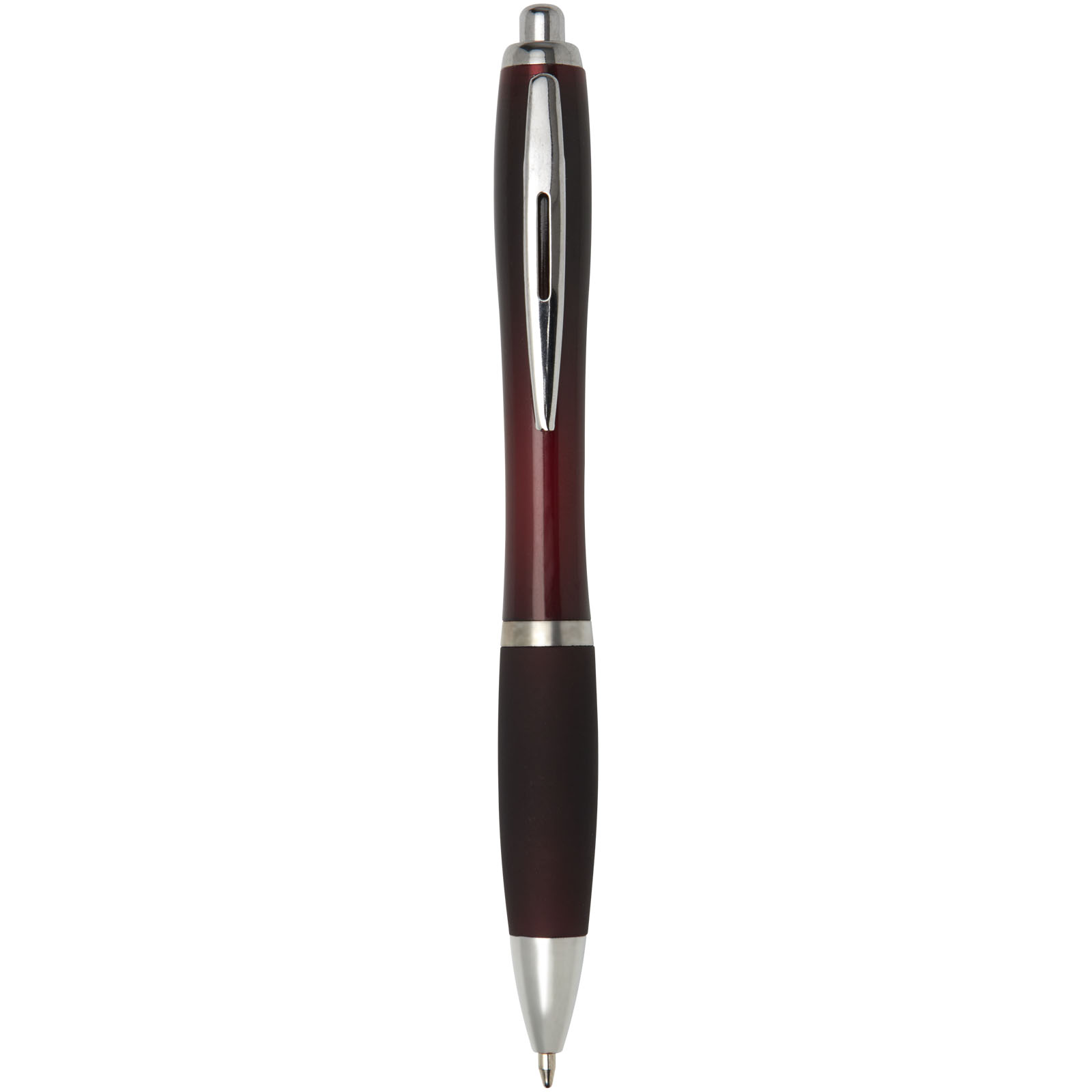
The second most common mistake is a multicolour logo with light elements (yellow, light grey, white) on a light-coloured product. In that case, the solution is an outline, a darker version of the logo, or a white background panel behind the logo.
Three Logo Versions You Always Need
- full-colour version for a light background;
- single-colour white version for a dark background;
- single-colour black version for metal, wood and natural-coloured fabric.
How Colour Pairings Work in Practice
| Product colour | Recommended logo colour | Visibility | What to avoid |
|---|---|---|---|
| White, natural beige | Brand colour or black | Very good | Light yellow, light grey |
| Light grey, light blue | Dark brand colour | Good | White without outline |
| Navy, black, burgundy | White or a light single colour | Very good | Navy on black |
| Bright red, orange | White | Good | Black in small text |
| Neon yellow, lime | Black | Very good | White |
| Metallic, silver | Black or engraving tone | Medium to good | Pastel shades |
This table is a guideline only — the final result depends on the material's texture. On cotton, a print looks more matte and 5–10% darker than on smooth plastic.
The Printing Technology Determines Your Colour Options
Screen printing gives a dense, opaque colour even on black fabric, since the ink is applied in a thicker layer. Suitable for single-colour or 2–3 colour logos in larger runs.
DTF transfer allows printing photographic and multicolour logos with a white base layer, so it works on any fabric colour. It's the most common choice for runs of 1 to 100 pieces.
Embroidery reproduces colours using a thread palette rather than exact Pantone matching. The difference is usually one shade lighter or darker. However, embroidery is the most visible option on dark sweatshirts and caps.
Sublimation only works on white or very light polyester items — it isn't possible on dark fabric, since the colour is translucent.
Pantone, CMYK, and Why It Looks Different on Screen
A monitor displays colour using light (RGB), while printing uses pigment (CMYK). Bright greens, oranges and deep purples usually turn out 10–15% more muted in print. If your brand colour is critically important, specify the Pantone number — in screen printing it can be mixed exactly, while in digital printing we achieve the closest possible match.
Send files as vector graphics (.ai, .eps, .pdf) with CMYK colours and fonts converted to outlines. This allows us to change the logo colour instantly if it turns out that the chosen product colour needs a white version instead.
A Catalogue Example: When There Are Many Colours
A good example from our promotional products catalogue is the Helios 180 g/m² men's short-sleeve polo shirt, available in 62 colours. Such a wide palette means you can almost always find a shade that matches your brand identity — but that's exactly why there's a risk of choosing a colour that's too close to your logo colour.
Practical tip: if your brand colour is, say, dark green, choose the polo in white, light grey, or the opposite — black with a white version of the logo. Use the brand colour as an accent rather than for the whole product. A density of 180 g/m² is sufficient so the print doesn't show through on the other side and embroidery doesn't pucker the fabric.
If you're ordering several products for one team (polos, T-shirts, caps), choose one logo version per background type rather than a separate solution for each product — this way the whole set looks consistent.
Checklist Before Ordering
- Check the contrast in greyscale.
- Make sure you have a white logo version for dark products.
- Determine the print area size: T-shirt 200–250 mm, mug 80–90 mm, pen 40–50 mm.
- Specify the Pantone if the colour is critical.
- Send a vector file, not a screenshot.
- Request a digital artwork proof — we prepare it before production and send it by email for approval.
Prices and Timelines
Prices are indicative, excl. VAT, and depend on quantity, number of colours, and the printing technology used.
| Product and printing | Indicative price per piece | Timeline |
|---|---|---|
| Polo shirt with 1-colour print, from 25 pcs | from EUR 14 | 5–8 business days |
| T-shirt with DTF print, 1–10 pcs | from EUR 12 | 5–10 business days |
| Embroidery on a cap, from 20 pcs | from EUR 8 | 7–10 business days |
| Pen with logo, from 100 pcs | from EUR 0.90 | 5–10 business days |
| Mug with full-colour print, from 10 pcs | from EUR 7 | 5–10 business days |
Timelines are counted from artwork approval. We also work with single pieces; unit prices decrease for larger quantities. Urgent orders are handled by separate agreement.
FAQ
How can I tell if my logo will be visible on the chosen product colour?
Convert both the logo and the product colour to greyscale. If the brightness difference is small, the logo will blend into the background. We show this visually in our artwork proof before production.
Can white be printed on dark fabric?
Yes. In screen printing, we apply white in a dense layer; in DTF transfer, a white base layer is printed underneath the image. Sublimation isn't suitable for dark fabric.
How accurately is a Pantone colour reproduced?
In screen printing, we mix the colour exactly to Pantone. In digital printing and DTF transfer, we achieve the closest possible match — usually the deviation is minor, but more noticeable on bright greens and oranges. In embroidery, we choose colours from the thread palette.
How many logo colours are optimal for a promotional product?
For small items — one or two colours, since fine details disappear in a print area under 50 mm. For clothing and bags, a full-colour logo can be used with DTF transfer.
What format should I send my logo in?
Vector graphics: .ai, .eps or .pdf with CMYK colours and fonts converted to outlines. If you only have a raster image, we can vectorise it for an additional fee.
Can I order a sample before a large production run?
Yes, we prepare a printed sample in 2–4 business days. This is recommended if you're ordering more than 100 pieces or if colour accuracy is critical.