CMYK vs RGB: why print colours look different
Why does blue glow on screen but look muted in print? We explain the difference between CMYK and RGB, and how to prepare your file so colours don't disappoint.
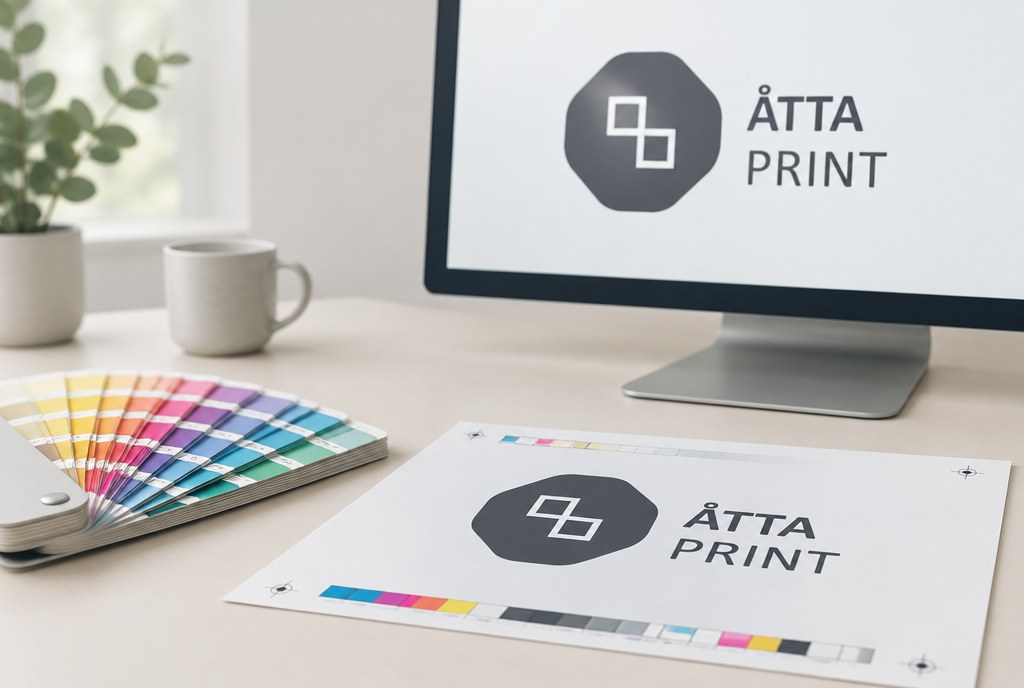
CMYK and RGB print differently because a screen creates colour with light (red, green, blue), while print uses transparent inks on paper (cyan, magenta, yellow, black). The RGB colour space covers roughly 30–40% more shades than standard CMYK printing, so bright blues, neon greens and vivid oranges will always look more saturated on screen than on paper. If you submit a file in RGB, we'll convert it to CMYK anyway — it's better if you control that conversion rather than leaving it to automation.
What exactly is the difference
RGB is an additive model: the more light you add, the brighter the colour, and all three together produce white. Monitors, phones and TVs all work this way. CMYK is subtractive: the paper starts out white, and each layer of ink removes part of the reflected light. All four inks together produce a dark muddy brown rather than true black — which is why print uses a separate black ink (K).
The practical consequence is simple: some RGB colours simply cannot be reproduced with ink. Classic problem tones are RGB 0,0,255 blue (which turns dark purple in print), bright green 0,255,0, and neon pink or orange.
Which colours most often "disappear"
| Colour on screen (RGB) | What happens in print | Solution |
|---|---|---|
| Vivid blue (0,0,255) | Turns dark purple | Use C100 M60 Y0 K0 or Pantone |
| Neon green (0,255,0) | Turns dull grass green | Pantone Neon, or accept a duller tone |
| Neon orange/pink | Loses its glow | Pantone 806/811 in screen printing |
| Deep black text | Can look greyish | K100 for text, C60 M50 Y40 K100 for large areas |
| Light pastels | Can show banding | At least 8–10% ink coverage |
How to convert a file correctly
We accept vector graphics (.ai, .eps, .pdf) in CMYK colour space. If you work in Illustrator or InDesign, set the document colour mode to CMYK from the start — then you'll see roughly what you'll get. If your design is already in RGB, do the conversion yourself and then check whether any colour has become unacceptable; fix specific tones by hand afterwards.
For photographs, the recommended profile for Latvia and Europe is ISO Coated v2 (for glossy and matte coated paper) or PSO Uncoated v3 for uncoated paper. Image resolution should be 300 dpi at actual size; for large-format banners 100–150 dpi is enough, since they're viewed from a distance.
Quick checklist before sending your file
- Colour mode CMYK, not RGB or Lab
- Text set to K100, not four-colour black
- Total ink coverage not exceeding 300%
- Fonts embedded or converted to outlines
- Bleed 2–3 mm, important elements 5 mm from the cut line
- Pantone colours specified separately if the tone is critical
When you need Pantone instead of CMYK
If your logo colour needs to match across a business card, a T-shirt and a banner, CMYK alone won't help — each material takes ink differently. In such cases we work with Pantone (spot) colours. In screen printing on garments, the colour is mixed according to the Pantone formula, so it's reproducible even a year later. Screen printing in 1 colour at 1 position starts at approximately EUR 3.50/pc, from 100 pcs — EUR 1.90/pc, plus a one-off setup fee of EUR 35.00 (prices excl. VAT, indicative).
In digital printing and DTF transfer, Pantone is imitated with CMYK, so a slight shift is possible. DTF up to A4 size starts at approximately EUR 6.00/pc, from 50 pcs — EUR 4.20/pc (excl. VAT). For a broader overview of printing methods, see garment printing.
How much deviation is normal
Colour variation always exists in the printing industry. In practice, we work with the following benchmarks:
| Comparison | Typical deviation | Comment |
|---|---|---|
| Screen vs print | Large, visible | Screen glows, paper reflects |
| Two prints in one order | Minimal | Same batch, same paper |
| Matte vs glossy material | Medium | Matte looks about 5–10% duller |
| Digital printing vs screen printing | Medium | Different inks and substrates |
| Paper vs PVC banner | Medium to large | Different ink systems |
If colour is critical — for example, corporate identity or food packaging visuals — we produce a test print before a large print run. Stickers on matte or glossy vinyl film cost approximately from EUR 24.00/m², from 5 m² — EUR 21.00/m², from 20 m² — EUR 18.00/m² (excl. VAT); a small test piece doesn't add significantly to the cost. For prices and materials, see stickers.
What to do if you can't prepare the file yourself
If all you have is an RGB image from social media or a JPG without bleed, send it as is — our project manager Madara will assess whether the quality is sufficient for the chosen size and tell you what needs to be reworked. Simple file preparation (colour conversion, adding bleed) is usually done at no extra charge; creating a design from scratch is quoted separately.
Timelines: business cards, flyers and posters usually take 2–5 business days, catalogues and garment printing 5–10 business days from artwork approval. Urgent jobs — by arrangement. You'll find our full range of printing services in the catalogue section.
Frequently asked questions
Can I send an RGB file?
Yes, and we'll convert it to CMYK, but then the colour outcome will be left to automation. If a particular tone matters, it's better to convert the file yourself and check the problem tones, or specify a Pantone code.
Why does blue look purple in print?
RGB 0,0,255 falls outside the CMYK gamut. Ink can only reproduce it as C100 M100 or a similar combination, which appears purple to the eye. The solution is to use C100 M60 or a Pantone spot colour.
Does a test print cost extra?
A small test print in digital printing or on vinyl film is usually included if the order is of sufficient volume. For screen printing and embroidery, a test sample requires separate setup, and we agree on that individually.
How do I make sure my logo colour matches on a business card and a T-shirt?
You need to specify a Pantone colour and accept that the tone on fabric will always look slightly different than on coated paper. In practice, we agree on an acceptable deviation and approve a sample.
What resolution does a banner need?
For PVC banners and roll-up banner stands, 100–150 dpi at actual size is enough, since viewing distance is 2 metres or more. Small-format printing — business cards, flyers, catalogues — needs 300 dpi.
What is 300% ink coverage and why does it matter?
It's the sum of all four colours at a single point. If it exceeds 300%, the paper can't absorb the ink: printing dries slowly, can smear or bleed through the sheet. Create dark areas as C60 M50 Y40 K100.
If you're not sure whether your file is print-ready, send it to info@attaprint.lv or WhatsApp +371 25776699 — we'll check the colour space, resolution and bleed. We prepare quotes within one business day.
FAQ
Can I send an RGB file?
Yes, and we'll convert it to CMYK, but then the colour outcome will be left to automation. If a particular tone matters, it's better to convert the file yourself and check the problem tones, or specify a Pantone code.
Why does blue look purple in print?
RGB 0,0,255 falls outside the CMYK gamut. Ink can only reproduce it as C100 M100 or a similar combination, which appears purple to the eye. The solution is to use C100 M60 or a Pantone spot colour.
Does a test print cost extra?
A small test print in digital printing or on vinyl film is usually included if the order is of sufficient volume. For screen printing and embroidery, a test sample requires separate setup, and we agree on that individually.
How do I make sure my logo colour matches on a business card and a T-shirt?
You need to specify a Pantone colour and accept that the tone on fabric will always look slightly different than on coated paper. In practice, we agree on an acceptable deviation and approve a sample.
What resolution does a banner need?
For PVC banners and roll-up banner stands, 100–150 dpi at actual size is enough, since viewing distance is 2 metres or more. Small-format printing — business cards, flyers, catalogues — needs 300 dpi.
What is 300% ink coverage and why does it matter?
It's the sum of all four colours at a single point. If it exceeds 300%, the paper can't absorb the ink: printing dries slowly, can smear or bleed through the sheet. Create dark areas as C60 M50 Y40 K100.