Pantone colours in printing: why screen and garment tones differ
Why a Pantone colour looks different on screen than on a printout or T-shirt, and how to get as close a match as possible with each printing technology.
Pantone colours in printing differ from what you see on screen because a monitor creates colour with light (RGB), while printing creates it with pigment on a specific material (CMYK or mixed Pantone ink). In screen printing with mixed Pantone ink, you can usually achieve an almost exact shade; in digital CMYK printing, roughly 85–90% of Pantone shades are reproducible with only a slight deviation, but bright oranges, greens, dark blues and metallic tones often differ noticeably. In practice, the safest approach is to order a physical sample — we prepare one in 2–5 business days (5–10 business days for a printed garment or item).
What a Pantone colour actually is
The Pantone Matching System (PMS) is a colour catalogue in which each shade corresponds to a specific base ink formula. For example, Pantone 300 C isn't "some kind of blue" — it's a precise pigment ratio that a print shop or screen-printing studio can mix and reproduce identically even a year later.
It's important to pay attention to the suffixes:
- C (coated) — the shade on coated, glossy paper;
- U (uncoated) — the same number on uncoated paper looks lighter and more muted;
- TPX / TCX — textile colour scales used for garments and fabrics;
- Neon and metallic — separate series that, in principle, can't be reproduced in CMYK printing.
That's why it's important to specify not just "Pantone 300" but "Pantone 300 C" — especially if the same logo needs to be printed on both business cards and a T-shirt.
Why the screen lies
A monitor emits light and can display a far wider colour range than ink can achieve on paper or fabric. Several other factors add to this:
- the monitor isn't calibrated — two of a client's computers may show the same file differently;
- a phone screen automatically boosts saturation;
- the file is in RGB rather than CMYK, so conversion only happens at the printing stage;
- office lighting. Under warm LED light, grey turns yellowish; under daylight from a window, it turns bluer. This effect is called metamerism, and it's one of the most common reasons clients say "it looked different in person."
That's why we ask for working files in vector format (.ai, .eps, .pdf) with Pantone or CMYK values specified. For more on preparing files, see our printing services section.
How accurate is colour in each technology
| Technology | Pantone accuracy | Notes |
|---|---|---|
| Screen printing with mixed Pantone ink | Very high, ΔE usually under 2 | Each colour = a separate screen, so cost-effective from 30–50 pcs |
| Offset printing with Pantone ink | Very high | For large paper print runs from ~1,000 pcs |
| Digital printing (CMYK) | Medium, ΔE 2–6 | About 85–90% of shades close; corporate blues and oranges may deviate |
| DTF transfer | Medium | Good for detail and photos; Pantone only approximated |
| Sublimation | Medium | Light-coloured polyester only; shade depends on fabric whiteness |
| Embroidery | Approximate | Nearest thread from the palette is chosen, not a formula |
| UV printing on mugs, pens | Medium | The material's base colour affects the result |
ΔE is a unit of colour difference: under 2, the human eye practically can't tell the difference; 3–5 is noticeable side by side; above 6, the difference is obvious.
The material changes everything
The same ink looks different on different surfaces. On glossy stickers, colour appears saturated; on matte, it's muted by roughly one shade level. On uncoated paper, ink soaks in and the tone becomes lighter.
With garments, the base fabric colour is decisive. On a black cotton T-shirt, coloured ink needs a white underbase, which slightly shifts the top colour. On grey melange, the fabric is a fibre blend, so the colour always looks a bit "dusty." On rough canvas or a tote bag, the ink partially sinks into the fibre. In practice, this means: if a Pantone 185 C logo needs to be printed on white, black and grey T-shirts, expect three slightly different results, even though the ink is the same. For more on choosing the right technology, see the garment printing page.
What to do in practice
1. Define your brand colours as a full set
Your brand book should include: Pantone C, Pantone U, CMYK, RGB and HEX values, plus TCX for garments. That way, whatever technology is used, the printer knows the reference point.
2. Order a sample
If the colour is critical (sports club kit, restaurant packaging, municipal materials), order a single sample on the specific material. As a rough guide, one printed T-shirt sample starts from EUR 15, and a paper print proof from EUR 5 (excl. VAT). The exact price depends on quantity and the printing method.
3. Evaluate the sample correctly
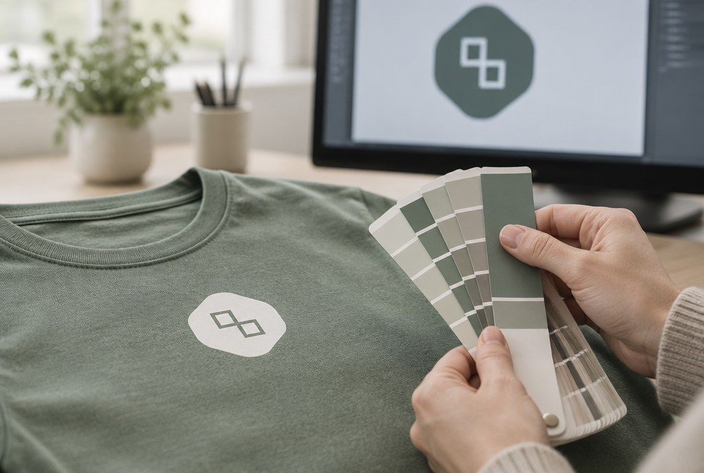
Compare the sample with the Pantone fan deck in daylight or under neutral 5000K lighting — not under office lamps and not against a screen background.
4. Plan your timeline
The standard lead time for printed promotional products is 5–10 business days after artwork approval; for stickers, banners and posters, 2–5 business days. If Pantone ink mixing is needed for screen printing, allow 1–2 extra days; if a sample approval cycle is needed, allow another 2–4 days. Urgent jobs can be arranged by agreement.
5. Accept a realistic tolerance
In the industry, a normal tolerance for digital printing is ΔE up to 5, and for screen printing with Pantone ink, ΔE up to 2. Slight differences between batches across different print runs are normal, especially if the fabric comes from a different dye lot.
Frequently asked questions
Can a Pantone colour be matched exactly on a T-shirt?
With screen printing and mixed Pantone ink — practically yes, the deviation usually isn't noticeable. With DTF or sublimation, the result is an approximation, since the colour is built from a CMYK base. If the logo colour is critical, choose screen printing from 30–50 pieces.
Why does one Pantone colour look different on a business card and on a T-shirt?
The base material, ink and surface gloss all differ. Paper reflects light evenly, while fabric scatters it. This is a normal and unavoidable effect; you can achieve a visually close result, but not an identical one.
Can I send an RGB file?
We can work with it, but the conversion to CMYK will happen on our end, and the brightest tones will become muted. It's safer to send a vector file (.ai, .eps, .pdf) in CMYK mode with Pantone numbers specified.
How much does an extra Pantone colour cost in screen printing?
Each colour requires a separate screen and setup, so the setup fee is roughly from EUR 15–25 per colour (excl. VAT), plus the per-piece printing cost. For large print runs, this cost per unit becomes negligible.
How long do I have to wait for a colour sample?
We prepare a paper print proof in 2–5 business days, and a printed garment or item sample in 5–10 business days, depending on the technology.
If you're not sure which technology will give you the shade you need, send your logo and Pantone numbers to info@attaprint.lv or message us on WhatsApp at +371 25776699 — we'll prepare a quote with a technology recommendation within one business day.
FAQ
Can a Pantone colour be matched exactly on a T-shirt?
With screen printing and mixed Pantone ink — practically yes, the deviation usually isn't noticeable. With DTF or sublimation, the result is an approximation, since the colour is built from a CMYK base. If the logo colour is critical, choose screen printing from 30–50 pieces.
Why does one Pantone colour look different on a business card and on a T-shirt?
The base material, ink and surface gloss all differ. Paper reflects light evenly, while fabric scatters it. This is a normal effect — you can achieve a visually close result, but not an identical one.
Can I send an RGB file?
We can work with it, but the conversion to CMYK will happen on our end, and the brightest tones will become muted. It's safer to send a vector file (.ai, .eps, .pdf) in CMYK mode with Pantone numbers specified.
How much does an extra Pantone colour cost in screen printing?
Each colour requires a separate screen and setup, so the setup fee is roughly from EUR 15–25 per colour (excl. VAT), plus the per-piece printing cost. For large print runs, this cost per unit becomes negligible.
How long do I have to wait for a colour sample?
We prepare a paper print proof in 1–2 business days, and a printed garment or item sample in 2–4 business days, depending on the technology.